We are a full-service digital agency dedicated to creating, developing, and marketing high-performing digital experiences. From initial concept to final growth strategy, we blend innovative design with robust development to help your brand thrive. Our end-to-end solutions ensure your digital presence is seamless, impactful, and built to drive measurable results.
25%
Increase in conversions after engaging with Tecbot for a UX/UI overhaul
68%
Increase in ticket sales with the launch of a new ticketing platform
60%
Decrease in cost per acquisition after moving paid media campaigns to Tecbot
243%
Increase in sales across digital channels after a website redesign and ongoing digital marketing campaign management
About us
Driven by creativity and powered by technology, we turn ideas into impactful results. Our focus is centred around the integration of three pillars - Design, Build & Reach.
The role of Contrast in UX Design and why you should avoid Pure Black
In the ever-evolving world of UX design, there's one principle that remains as essential as ever: contrast. Contrast plays a pivotal role in enhancing user experiences by making interfaces more visual
In the ever-evolving world of UX design, there's one principle that remains as essential as ever: contrast. Contrast plays a pivotal role in enhancing user experiences by making interfaces more visually appealing, easy to navigate, and accessible to a wider audience. However, it's important to note that achieving contrast doesn't mean reaching for the darkest shade of black. In this blog post, we'll explore why contrast is vital in UX design and why it's a good practice to steer clear of pure black in your designs.
The Role of Contrast in UX Design
Enhanced Readability One of the primary purposes of contrast in UX design is to improve readability. When text and other essential elements stand out clearly against their backgrounds, users can quickly scan content and absorb information. This is particularly crucial in scenarios where users need to read instructions, labels, or important messages.
Visual Hierarchy Contrast helps establish a visual hierarchy within a design. By using variations in color, size, or brightness, designers can guide users' attention to specific elements, such as calls to action or important content. This hierarchy simplifies the user's interaction with the interface by highlighting what matters most.
Accessibility Inclusive design is a fundamental aspect of UX, and contrast plays a pivotal role in ensuring accessibility. Proper contrast is essential for users with visual impairments, making it easier for them to perceive content. Meeting accessibility standards, such as WCAG (Web Content Accessibility Guidelines), often involves adhering to specific contrast ratios.
Aesthetics Beyond functionality, contrast also contributes to the overall aesthetics of a design. It adds depth, dimension, and visual interest to the user interface. Thoughtful use of contrast can make your designs more appealing and memorable.
Why Avoid Pure Black?
While black is a versatile color, pure black can be problematic in UX design for several reasons:
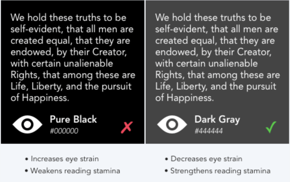
1. Harshness on the Eyes Pure black can be too harsh on the eyes, especially when displayed on bright screens. Staring at a stark black background for extended periods can lead to eye strain and discomfort.
2. Lack of Depth Pure black can flatten the design and make it appear two-dimensional. This lack of depth can result in a less engaging user experience.
3. Loss of Detail When you use pure black as a background color, it can obscure details and make it difficult to distinguish elements on the screen. This is especially true when working with text, icons, or images.
4. Limited Visual Hierarchy Pure black doesn't provide much room for creating a nuanced visual hierarchy. It lacks the subtlety and versatility that other shades of black or dark gray can offer.
Alternatives to Pure Black
Instead of pure black, consider using dark grays or other muted colors to achieve contrast while mitigating the downsides of using the darkest shade. Dark grays provide sufficient contrast for most applications while being easier on the eyes and offering more design flexibility.
In conclusion, contrast is a fundamental principle in UX design that significantly impacts the usability and aesthetics of a product. While contrast is essential, it's wise to avoid the harshness and limitations of pure black in your designs. By opting for darker grays and carefully considering contrast ratios, you can create visually appealing, user-friendly interfaces that cater to a wider audience while maintaining the integrity of your design vision. Remember, in UX design, balance is key, and contrast is your ally in achieving it.